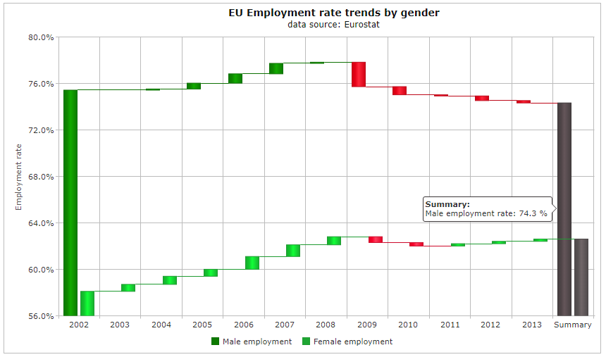
The Waterfall Chart is used to represent the cumulative effect of a measured series. It is shows the measured variables on a two dimensional chart where the time is set usually on the x axis and the measured variable is set on the y axis. The example below shows a waterfall chart with multiple series.
React Waterfall chart features
The color of the measured variable can be set in advance. Different colors can be set for positive and negative cumulative effects. The total can also be represented with different colors.
In addition you can have labels in the Waterfall chart. The labels appear when you set the mouse over the measured data.
You can change the shapes of the objects showing the measured variable.
Enabling animation makes it possible to show the measured variable in a different shade when the mouse is over it.
The labels can be put horizontally or vertically on the axes.
You can see an example here.