The Pie Chart chat is often used to visualize the relative size or the proportions of the measured variables. It represents a circular area (pie) which is sliced proportional to the relative size of the measurement. The pies can have different colors which improves the perception.
React Pie Chart features
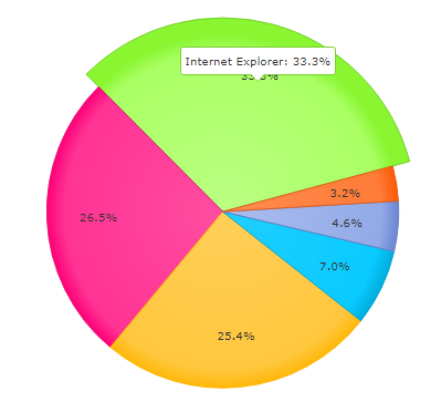
One very interesting feature is animation. When you move the mouse over one of the pie slices it enlarges and shows the value of the measured data.
The Pie Chart also provides a legend which can be positioned next to the chart. The legend shows the colors and the names of the measured variables.
You can also have a partial pie chart. The partial chart is depicted in the upper half of the circle. The partial chart also supports a toggle.
In addition you have several coloring schemas from which you can choose.
Localization. The data can be localized in different languages. All text, messages and captions of the data table can be localized.
You can see an example here.