The Bar chart is one of the types of charting components used very often. It is used to display data with rectangular bars or columns where the height of the bars is proportional to the values of the presented data. The bars can be with horizontal or vertical orientation and can have different colors and coloring schemas.
React Bar Chart basic capabilities
One basic capability of our React Bar chart is that data from two or more data series can be shown in one and the same chart. You can display the values of the different series with differently colored bars. The values of the series can also be grouped and presented together.
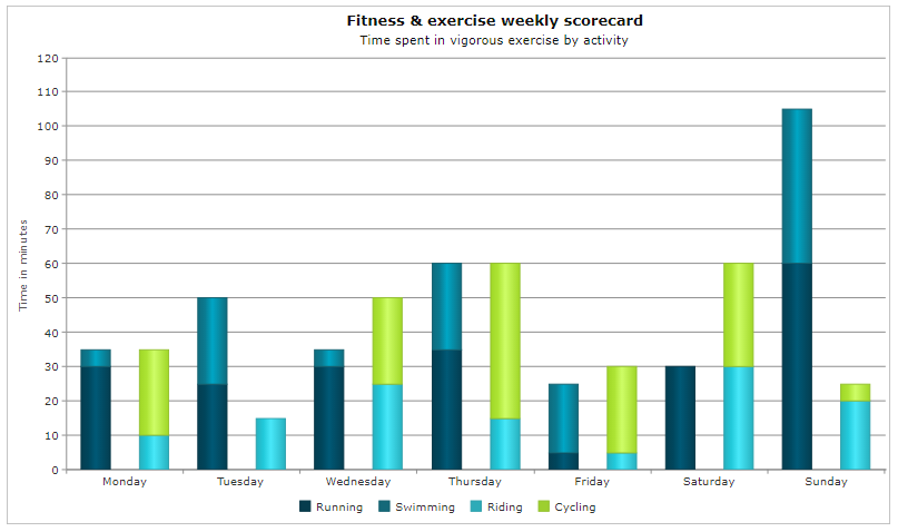
In addition, stacked bars are also possible to be displayed. The stacked bars enable you to show the values of two or more series in one column with different colors.
It is also possible to have labels on top of the columns which show the measured values.
React Bar Chart advanced capabilities
One advanced capability is the possibility to have 100% stacked columns. With 100% stacked columns you can show the data values of two or more series as percentages.
You can also have have conditional colors. Thus you can have bars with different colors based on a condition of the data where you can define your own conditions.
Additionally column ranges are also available. In this case the bar chart can be used together with another type of chart and show the data variations.
Negative values are also possible. In this case the columns can be drawn under the x Axis. You can define the spacing between the columns.