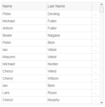
adaptive and adaptivewidth. adaptivewidth determines the Grid’s width that turns the adaptive mode on.
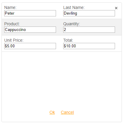
In adaptive mode, the Grid View automatically changes its layout, hides all overflowing columns and hides the horizontal scrollbar. The Grid displays one additional adaptive column with “…” rendered in each cell. By clicking on such cell, the Grid displays a detail view with the row’s data. If the component is in edit mode, you will be able to edit the data, too.
The image below illustrates how a Grid looks in Adaptive mode:
After clicking on adaptive cell, the view is changed to:
We hope that you will find this new feature useful for your web applications where responsive, fluid and adaptive layout are used.