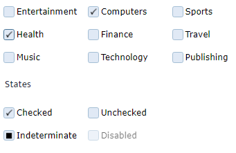
The CheckBox is a type of button which is used in user interfaces to facilitate the selection of different options. The Angular CheckBox component is a rectangular box which has true, falls and undetermined states. The user can check and select different states.
Angular CheckBox features
The CheckBox component enables four states: checked, unchecked, undetermined and disabled.
The Checkbox can have also different coloring schemas. The background color and the color of the check mark can be changed and configured in advance.
The CheckBox also supports fluid design and the width can be set in percentages.
You can see an example here.