With the Angular Tree component you can show information in a hierarchical way in the form of a tree. The tree has root item and below it parent and child items. Each item can be expanded if it has children or collapsed. The item which belong to the same parent are called siblings. The tree component is used very frequently in rich user interfaces.
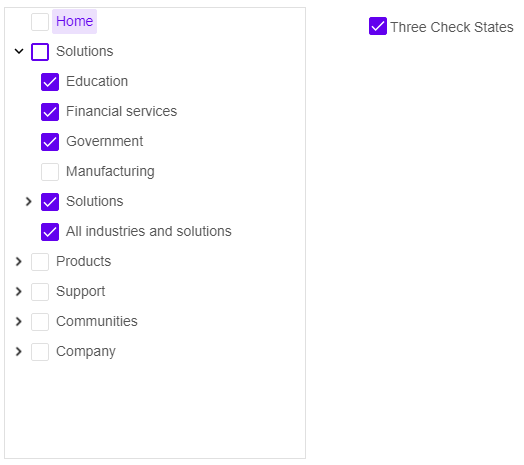
Our Angular tree enables putting a check box on the left of the item. Three state checkboxes are also possible. With a three state checkbox when the user checks the parent item its children become checked as well. When there is an unchecked item the parent is in an indeterminate state.
Angular Tree with CheckBoxes Features
In addition to checkboxes you can also put text and images on the left of the items.
The Tree component supports drag and drop so you can drag an element and drop it on another tree.
The text and background colors can be changed and preconfigured. You can also use our predefined Angular Material themes.
You can see an example here.