Paging is the capability of a Data Grid to display the data in pages which have a configurable number of rows. The paging capability also allows the user to move to different pages backward or forward with the help of arrows and to go to a specific page by entering the page number. The paging feature is a must have in all advanced data grids and is often used to enable the user to visualize the grid in a fixed space. Our Angular grid supports several different paging modes.
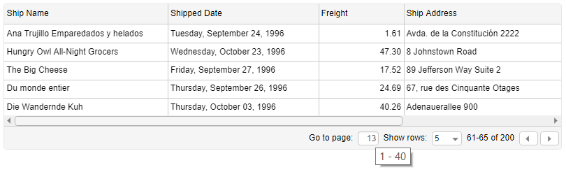
Angular Grid standard paging
The standard or default paging mode features a ‘go-to-page’ (input component where you can insert a page number), ‘show rows’ combo box (where the user can configure how many rows to be shown per page) and right and left arrow for movement to the previous or next page.
The initial page and the page size can be configured preliminary.
Angular Grid simple paging
By using the simple paging feature the user can go to the first and the last page, to the next and to the previous page and also to select a page by entering a number in a group of visible pages. There is also information which pages from all the pages available are shown.